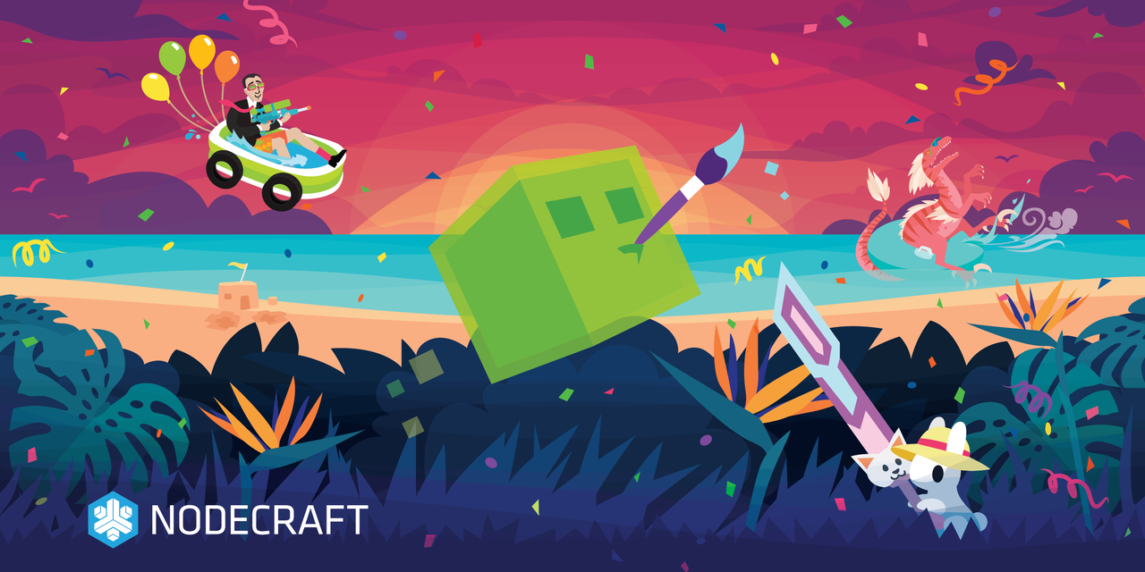
Today is Nodecraft's 10th anniversary! It's a big one and to celebrate, we're taking a moment to look over the development of one of the things that sets Nodecraft apart: Our heavy use of illustration, from landing pages to panel options. The Nodecraft illustration style has gone through a few evolutions since I've been working on it, starting in around 2015. So let's take look at some of the art through the years, style options that didn't quite make it past the concept stage, and what went into creating the style we use today! 🎉
🪅 Mashup 0.0: When we were almost pseudo-papercraft

The Nodecraft mashup is the image you see at the very top of nodecraft.com, and the first iteration of it happened to be the one of the very first projects I ever worked on with the company, as a commission artist back in the day. I was working with children's books at the time, and often used a vector style edited to look like layered paper cutouts. That was my first pitch for the Nodecraft style. While the paper cutouts weren't quite what we needed, you might be able to tell that we kinda liked that vector style!
I popped a vague reference to my favorite Minecraft mod at the time too-- The bear in the back is meant to be from TerraFirmaCraft, but as it turns out, bears also feature heavily in... you know. Just the woods in general, so suffice to say my reference wasn't super effective.
In the end, that original file was heavily edited with updated versions extending all the way up until a couple of weeks ago. Eventually we ended up with this image that made its way from the front page of the site, through all of our branding materials. Only now in 2022 is the last iteration of this original image officially becoming out of date and moving through the stages of being updated in all the many, many places it's been utilized. Ya did good, Mashup Classic.
🎃 Halloween 2015: When we almost went digital painting style

But back to 2015. At this point, we weren't quite sold on the vectors yet, and we had a little more experimentation to do before we made it official. The next project that came up was Halloween, and we decided to try out a few different styles to see what fit. This one was the furthest divergence from the others, with a more painterly look. While it was pretty fun and hit a vivid color palette that looks pretty familiar to our current art style (here's looking at you, pink and purple sky that I can't stop including in every piece), it wasn't quite a match for what we wanted. It was much harder to edit if I did something like, say... create a composition that had barely any room to add text. 👀 Plus, the assets made for it couldn't be resized very gracefully, and overall it was far, far more time consuming to produce.
Still, we did have a few other assets with a sketchy look before we moved on from this to fully embrace vector art. A couple of old favorites are this group of monsters:
And a troll that helps us remember that meme references are always a winner that never get old. 😅

💙 Summer 2018: When we learned as accessible allies
Once the style was decided, we were set! I worked to keep the illustrations varied and interesting, but some of those designs and color schemes had text as an afterthought, at this stage. I had a bad habit of not leaving enough room in the earliest work to fit the text in comfortably, and a couple of years in, I was finding that I had a lot to learn about keeping the text contrast in a range that was accessible for everyone. We had some interesting designs that needed significant tweaking before they went live, to handle text contrast issues.

That is not fun to read! 😨 Fortunately, our CTO James was very mindful of this, and we always caught these issues and corrected it before it went live. He had a great kit of resources to pass along, and I still utilize whocanuse to be sure my designs have compliant text treatments. Accessible text makes for better designs overall, and I count the point where we started working text contrast compliance into the art from the beginning, as a landmark in our improved illustration design.
🌟 Spring 2022: When we updated! New mashup and colors

All of that development landed us where we are today! Now, our style is defined by a color-saturated look, utilizing deep and bright tones, vector images that resize and can be altered easily without any quality loss, and frequent mashups of characters from our most popular supported games. I often check to see what games are most played at the time of creating a new piece of content, so checking out what games have characters featured on new art releases might give you a sneaky little look at which are most popular at any given time.
The development of Nodecraft's art style is an ongoing journey, and I can't wait to see what turns it will take in future iterations of the style! For now though, if you enjoy our art, keep a look out for our high def wallpapers featuring the new Nodecraft Mashup, and Mashup Classic as part of our 10th anniversary celebration. We'll be dropping them on Twitter later this week, so be sure to follow us if you want to snag some new art for your phone or desktop.
Thank you all for an amazing ten years, and here's to many more! 💙


